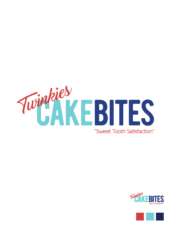
The CakeBites logo was our interpretation of how to make Twinkies feel more up to date. The logo was a collaboration of Emily Galeano and myself. Emily did the font layout, basic color identification, and the font for Twinkies. My contributions to the logo was the leading, rounding of the CakeBite font, final color choice, & font choice and color for the slogan.
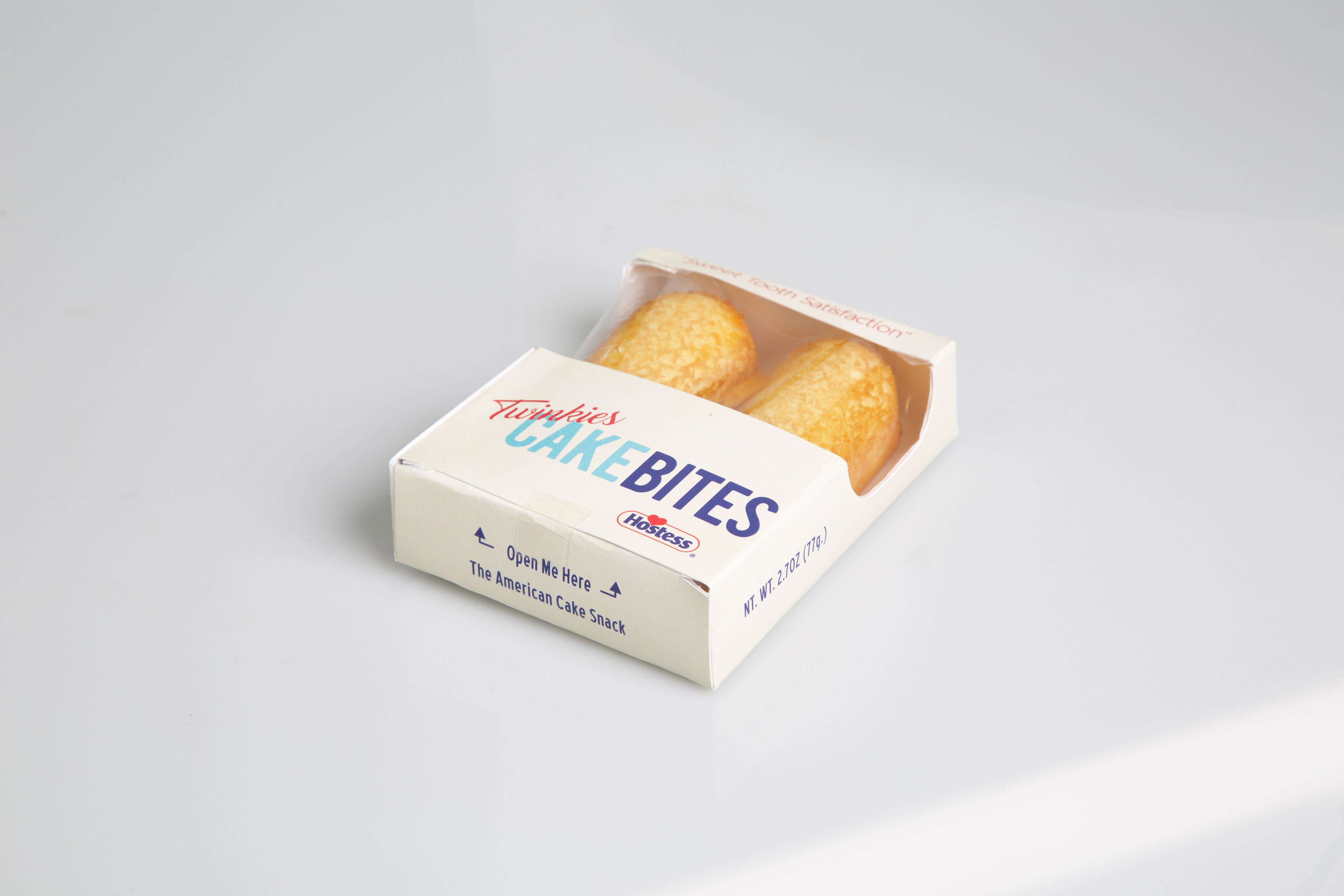

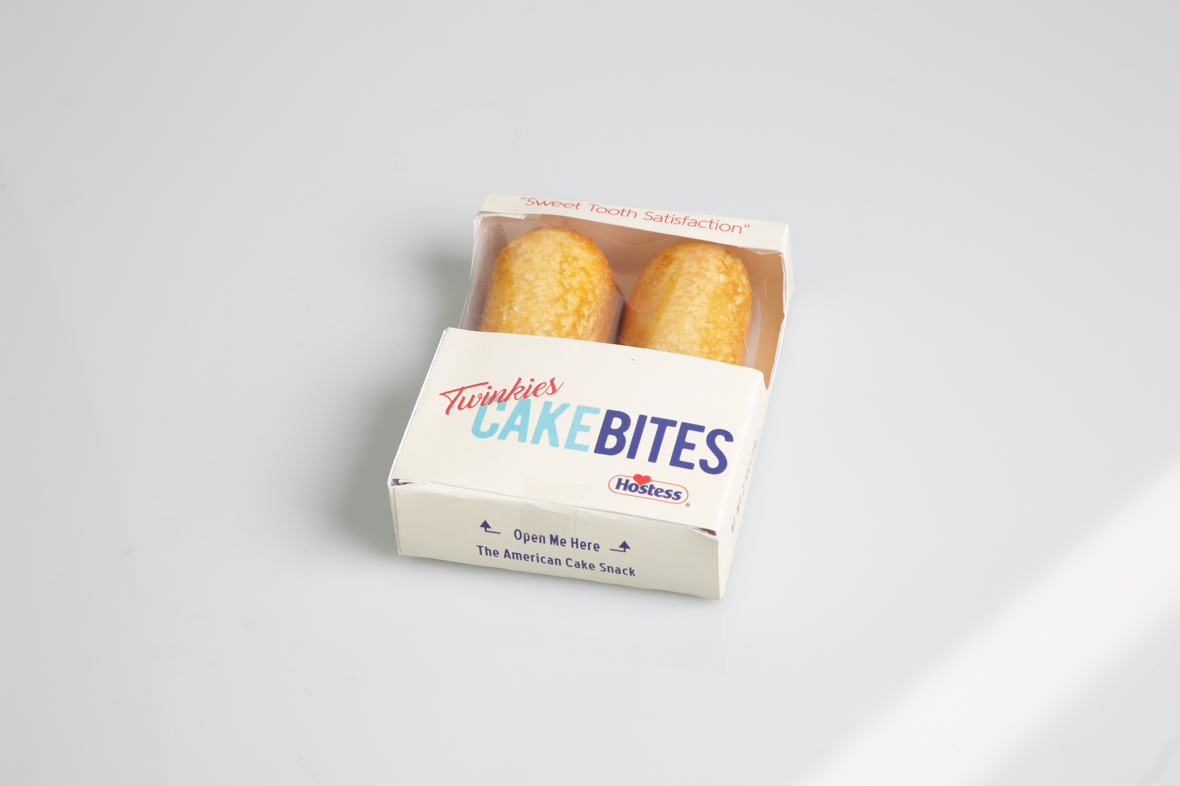
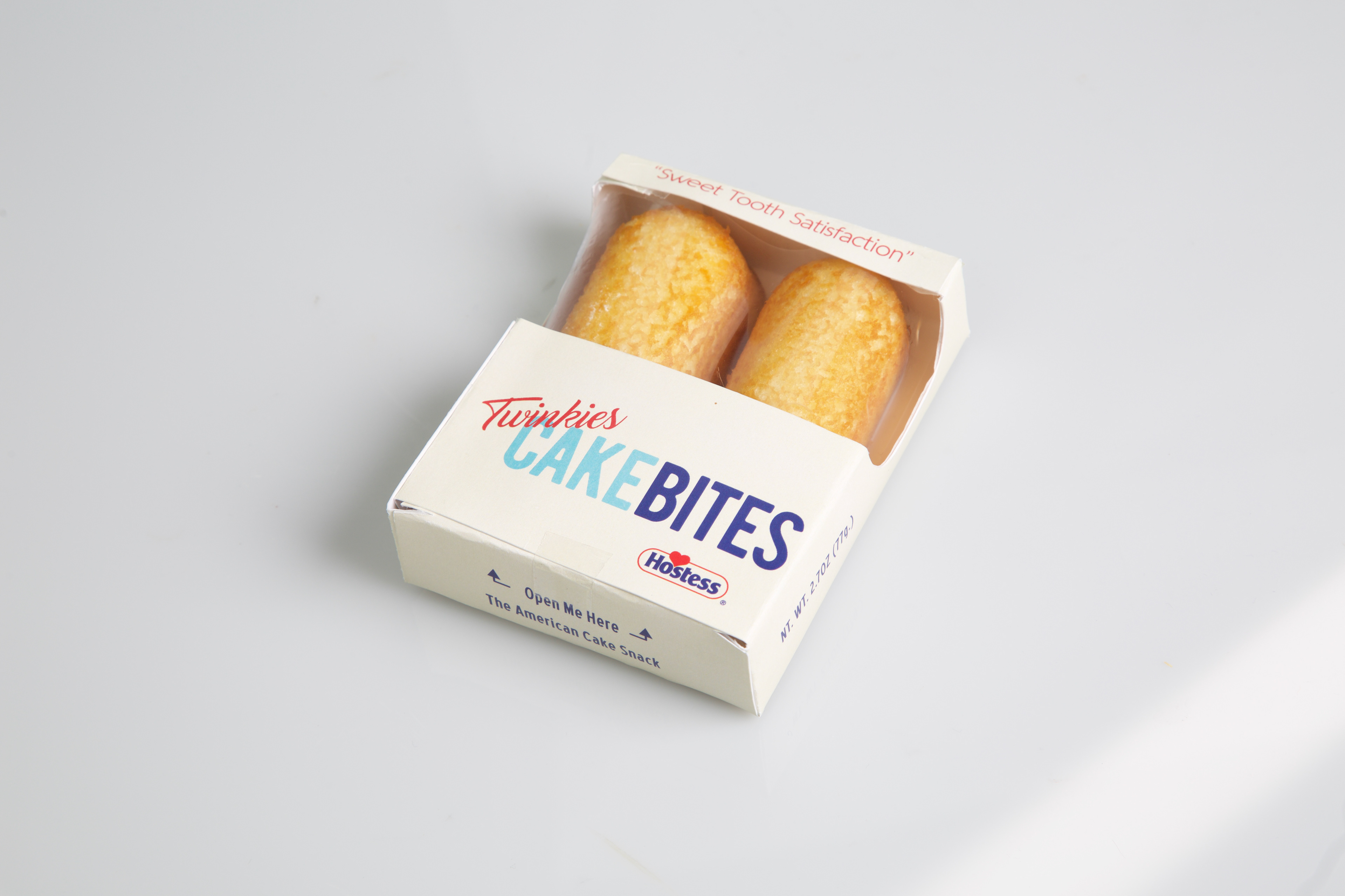
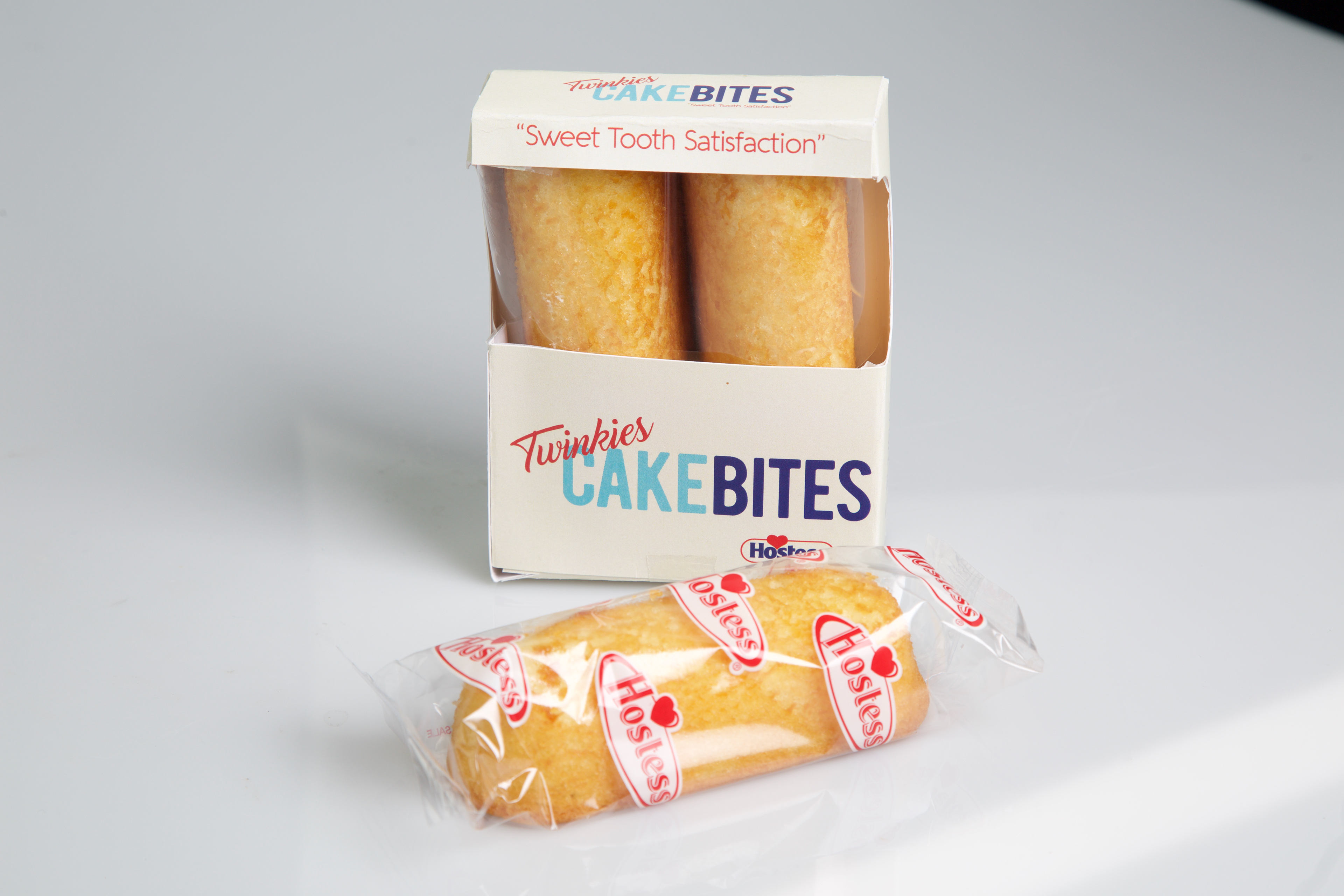
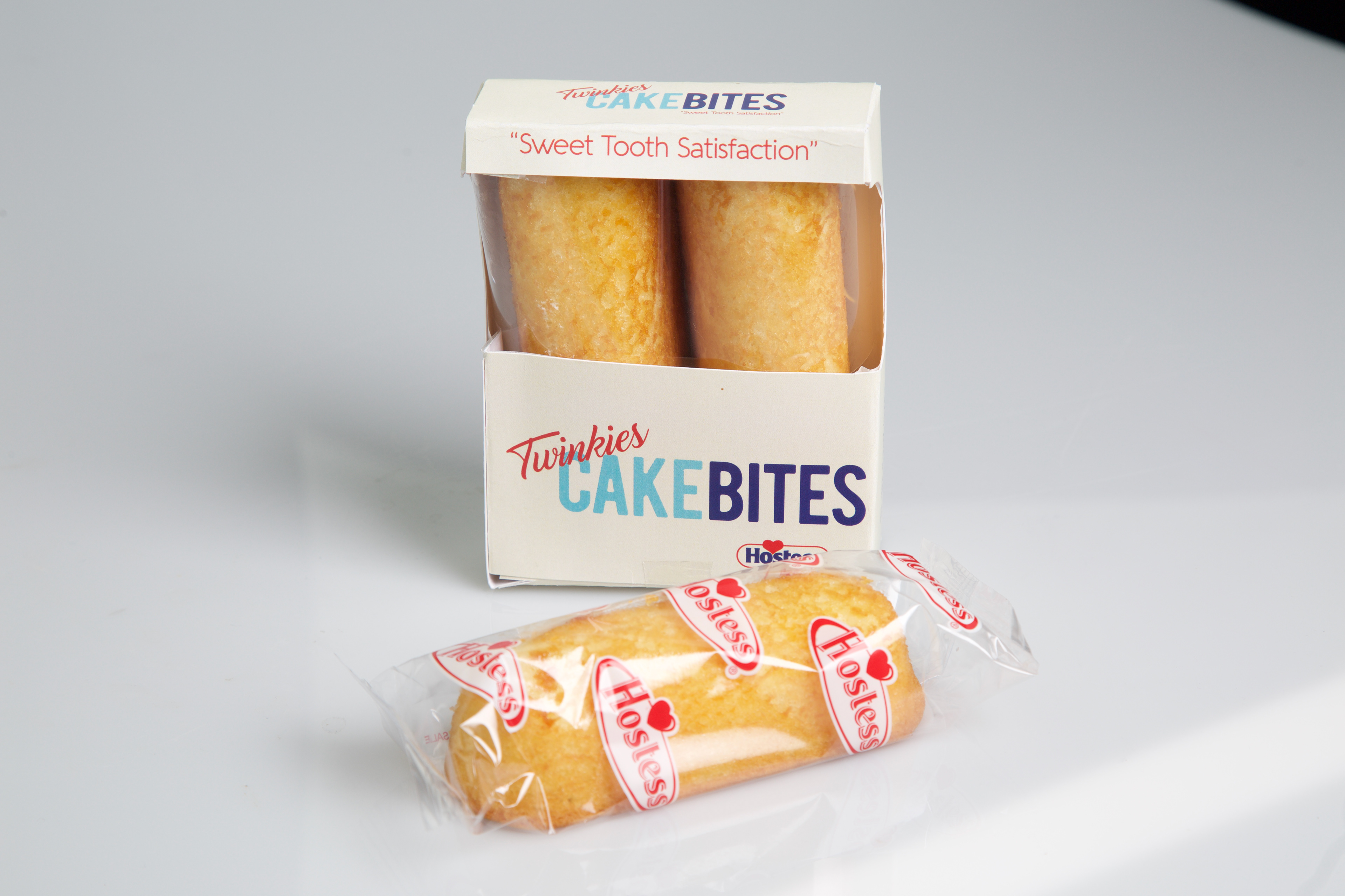

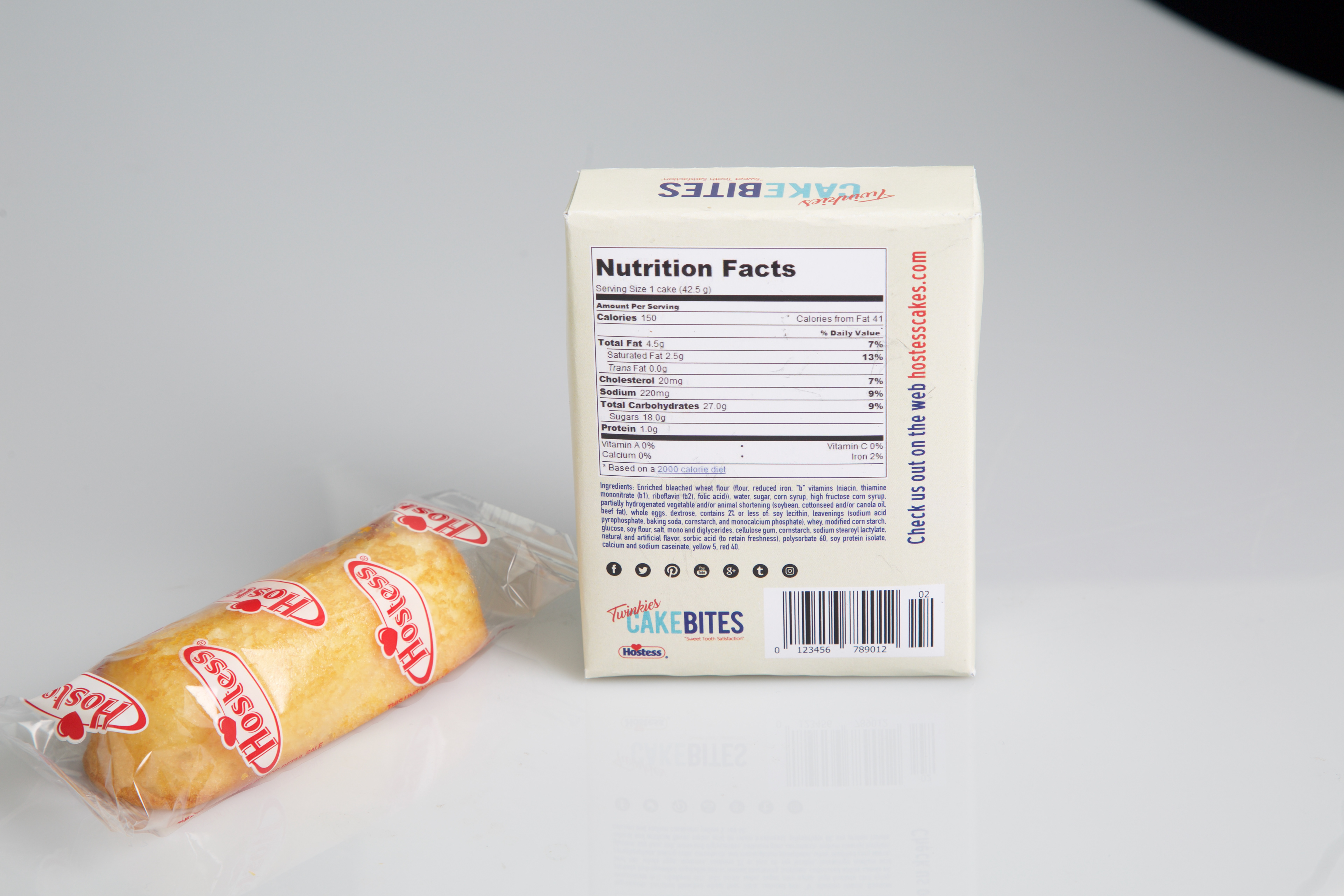
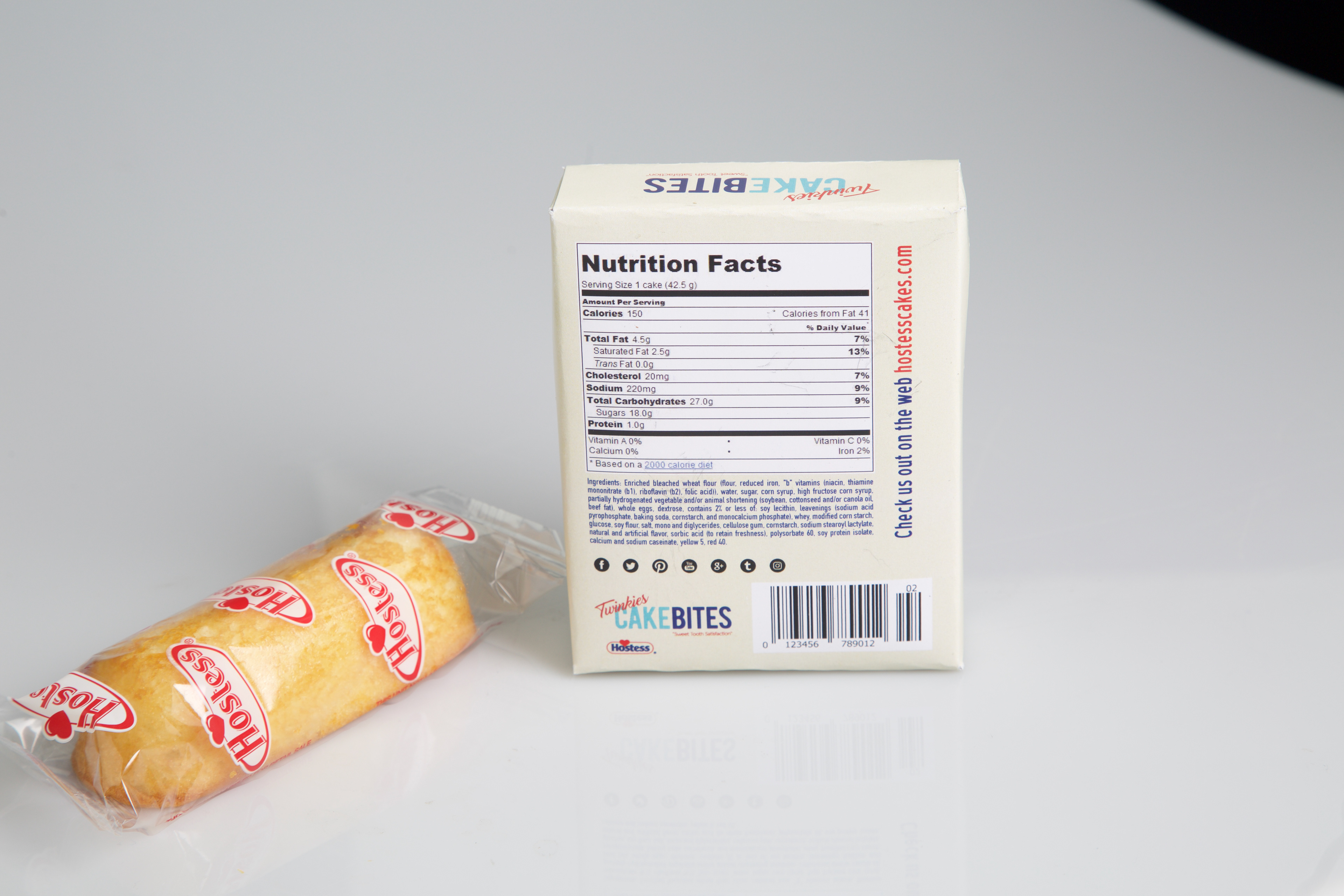
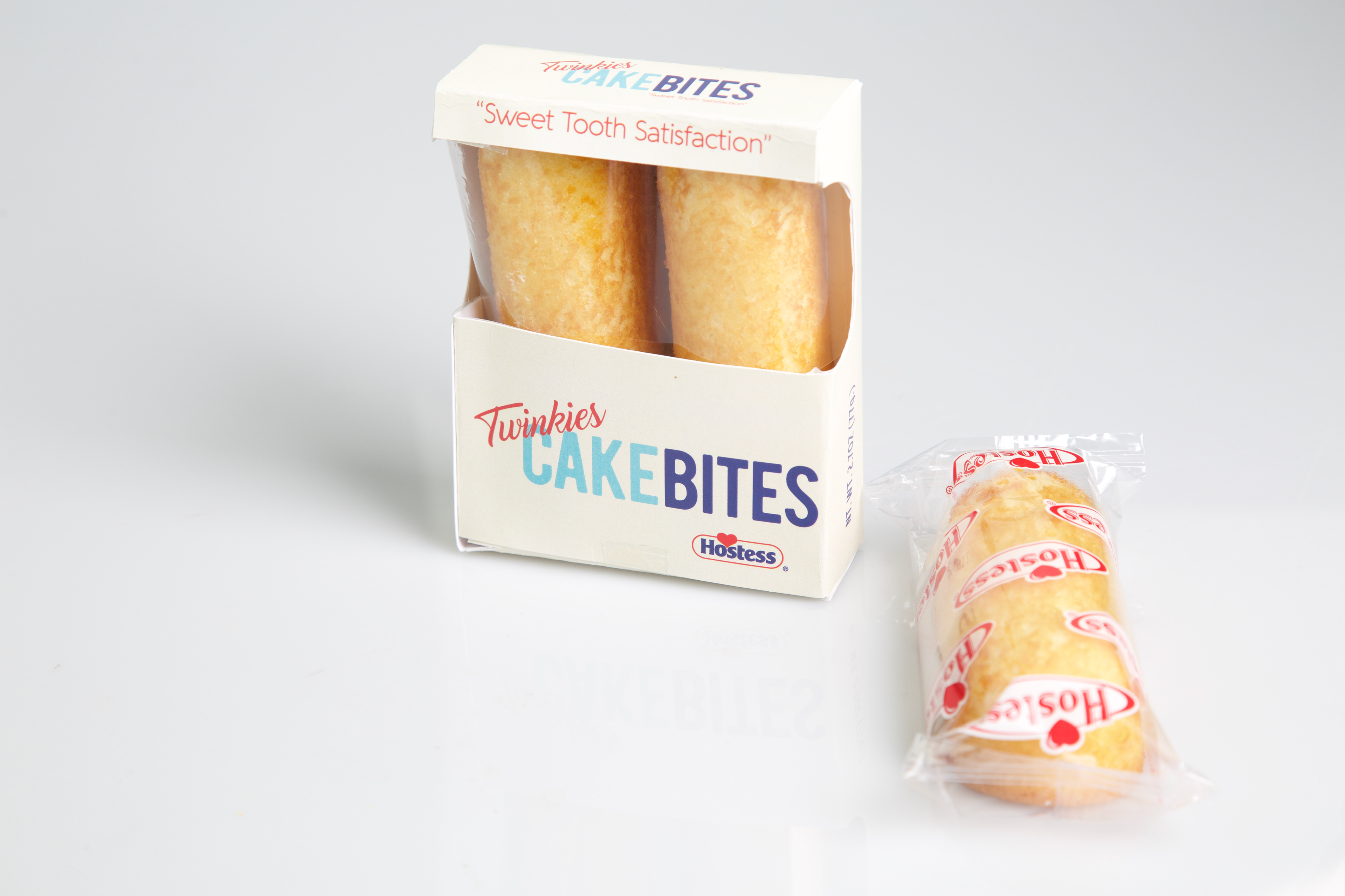
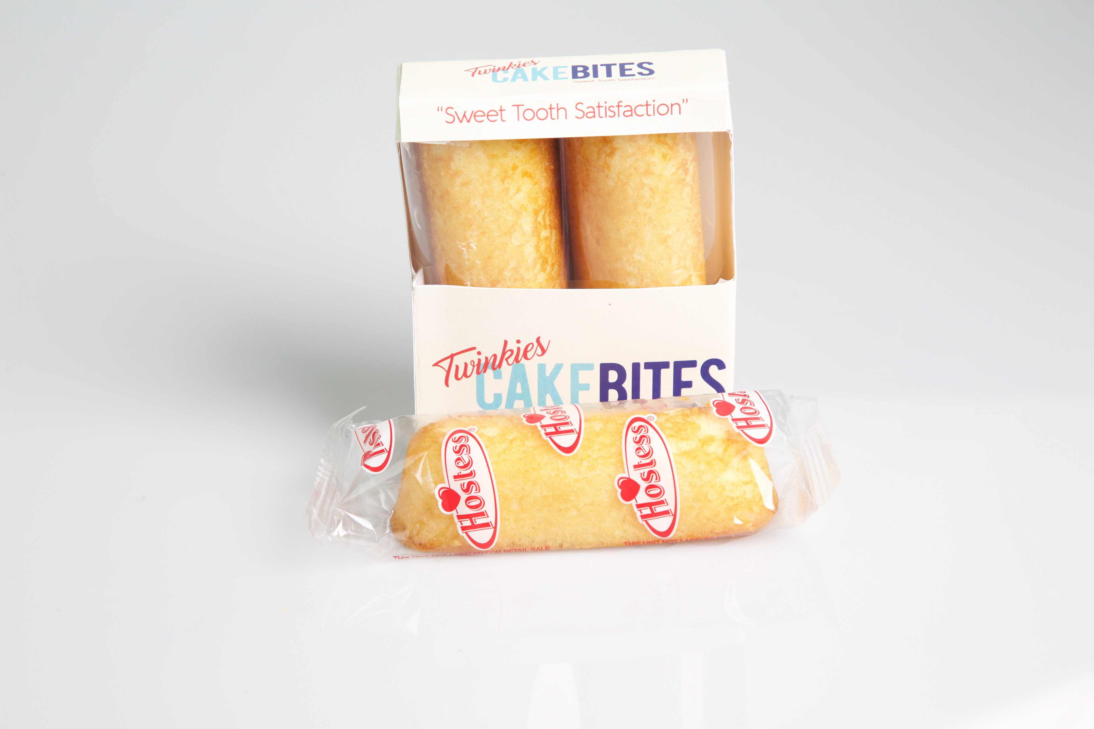
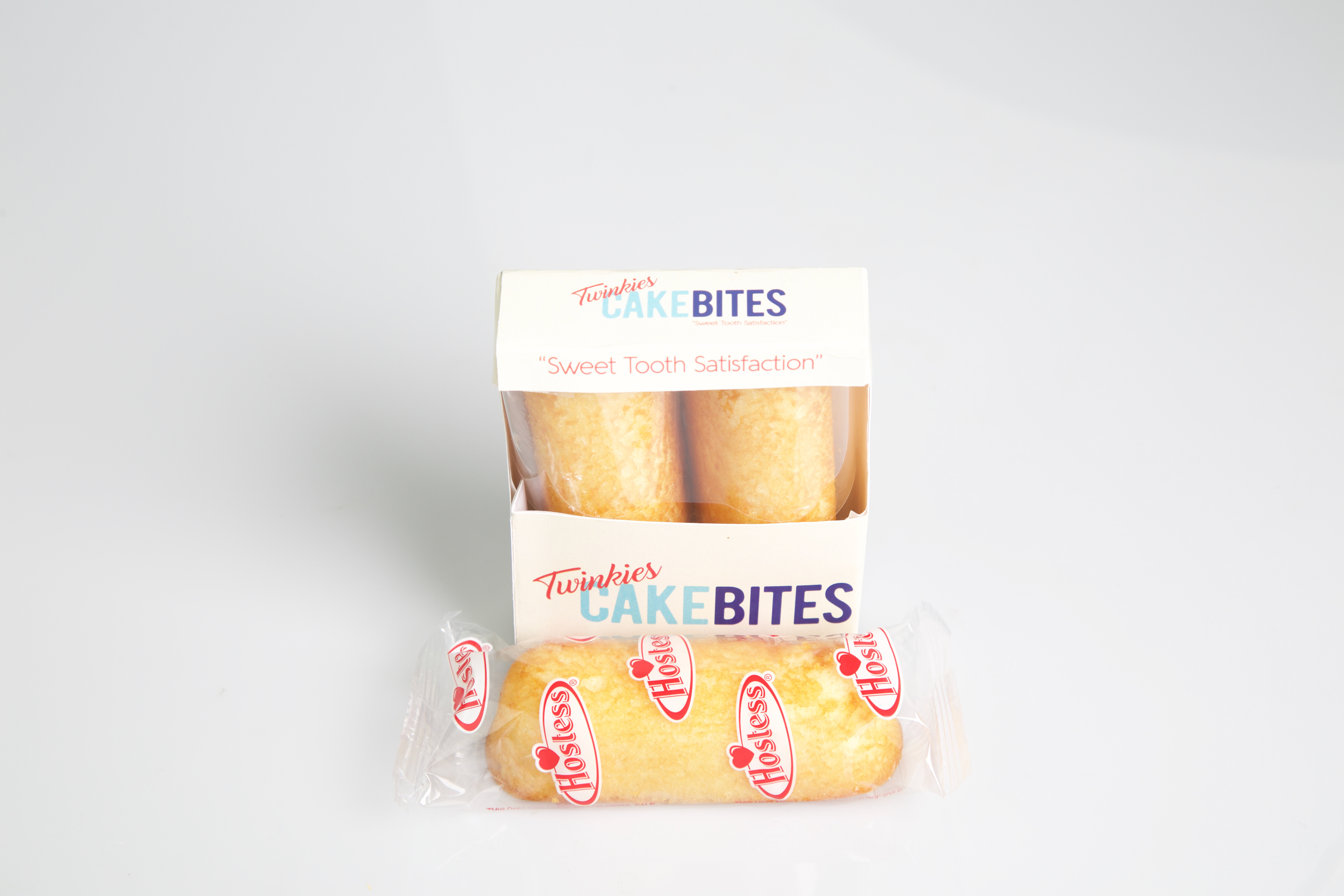
The Package Design was our way being more sleek and main stream, presenting Twinkies to the consumer in a new way. It's custom template, and was created from scratch to match our new appearance for Twinkies.
